The banner is a fantastic tool—when used correctly, it can amplify the Iowa story like nothing else. With the right combination of visuals, concise messaging, and clear calls to action, the banner becomes a dynamic way to grab attention and engage users. Let’s dive into how you can harness the full power of this component while keeping it visually appealing and effective.
Choose high-quality images
Avoid using generic page images or low-resolution visuals. Instead, select high-quality, high-resolution images that truly represent Iowa. Our Iowa Photoshelter account has thousands of high-quality and authentic images to choose from. It may take a few tries to find the perfect fit, but investing in a great image makes a huge difference in the banner's impact. We also recommend using images that are easy to read and responsive. Choose images that make text clear and legible, as some images can make smaller text difficult to read. Opt for a darker or lighter background and keep paragraph text minimal to improve accessibility. For responsive images, keep in mind that the banner image will adjust based on the viewport, banner height, and content within the block. Any of these factors may hide parts of the image, so it's best to use decorative images that don't require a specific focus. If needed, make sure the focus is centered. Lastly, we've also provided additional tips on how to select and find the best campus images for your website.
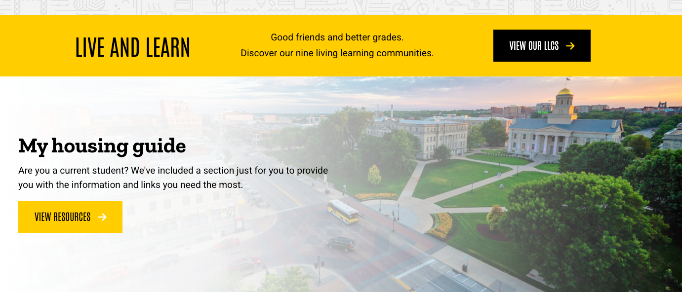
Limit the number of banners
Best practice is to use just one banner per page. Multiple banners can overwhelm your visitors and clutter the page. If you must use more than one, ensure they are distinctly different in layout and content, clearly indicating that they belong to separate sections of your website. Too many banners can distract from the main message, making it harder for users to focus on key information. Consider the flow of the page and place banners in a way that guides the user’s attention rather than competing with each other.
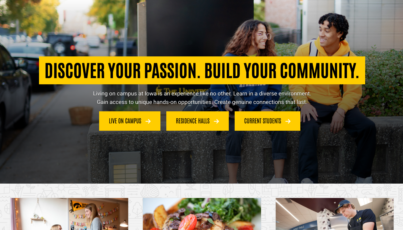
Use buttons thoughtfully
Buttons are an effective tool for encouraging engagement, but they should be used consistently. Keep the text on all buttons the same length to maintain uniformity in size and style. Descriptive language is essential—avoid vague phrases like “click here” and use specific calls to action that clearly communicate the purpose of the button. This makes the buttons more accessible and improves the overall user experience. Be mindful of placement, ensuring buttons are easily noticeable and positioned where users naturally expect to find them. A well-placed, clear button can significantly improve the flow of your website and guide users towards important actions.