Content blocks serve as a page building tool to create complex layouts with a mixture of different content. Below you will find information about Sections (the wrappers of all content blocks) as well as general information about how to work with the content blocks within the administrative interface.
Sections
Sections are top-level content blocks that wrap around and contain other content blocks.
Section Administrative Title
This isn’t displayed to users, but is helpful to organize content when working with more than one section on a page.
Add/Remove Content Blocks
Clicking the drop down arrow to the right of "Add Text" shows a list of available content types. By default, basic pages load with an initial section and "text area" content blocks. To remove individual content blocks within a section, click the three verticle dots on the right of the "Edit/Collapse" button.
Current Out Of The Box Content Block Types:
- Text
- Card
- Accordion
- Blockquote
- Events
- Articles
- Featured Content
- Accordion
- Webform
Settings
Each section and content block has additional settings tucked away. These are all optional and set with defaults. Some settings differ based on the type of content block.
Background Image
Available on sections, this allows you to place an image behind all nested content blocks within the section. See image specs for more details. It is recommended when using a background image within a section to keep all other section content to a minimum. The image fills the space of the section by stretching, so the more content (wrapped on smaller devices) the more the image will become pixelated.
Content Width/Alignment
Available in sections, these settings allow you to control the overall width and vertical/horizontal alignment of nested content blocks.
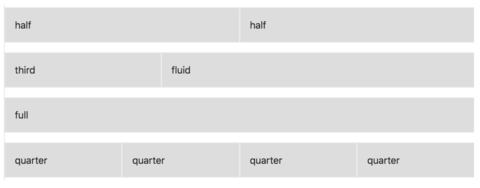
Column Width
For each content block within a section (see below), the the width defaults to “Full.” This means it will fill the entire width. Any additional content blocks will be placed under a full-width content block.
"Fluid" width content blocks will fill the horizontal space unless another content block within the same section gets in the way. Two or more fluid content blocks will create divide the horizontal space up equally.
The other options, Full, Quarter, Third, Half will set and respect certain widths.
See the figure below to see how the content blocks in each section (row) can be configure to create custom layouts.
Styles
Depending on the section or the content block, a select box might be available that allows additional styles to be applied to the content block. Though multiple classes can be selected, they might conflict with each other or only one might apply.
Unique ID
For each section and content block, a unique id can be created. Most commonly, these are used to create an anchor link to a particular area of a page.
When you enter a unique ID, on render, the site converts the value to sanitized identifier (no spaces/certain special characters, lowercase). "This is my anchor!" becomes "this-is-my-anchor"
Go to our WYSIWYG documentation to find out how to target these IDs as anchor links.
Actions
Each content block comes with actions which let you edit, remove or duplicate the content block.
Duplicating a content block will attempt to make a copy of everything within it, even other content blocks.
Reorder
There are two options for reordering content blocks:
Content blocks can be ordered by changing the row weight. This is done by clicking on the "Show row weight" button at the top right of the "Content Blocks" section.
Content blocks can be reordered by dragging the handle off to the left.
Note: You cannot drag an item to another level of nesting.