Basic Formatting
The What-You-See-Is-What-You-Get (WYSIWYG) text editor gives you the ability to format your content and add links/media. This text editor is available on most text areas around the site.
In most cases, the easiest way to go about editing is to write the content first, select specific text and then choose from one or more of the toolbar's buttons. Several buttons can be used together.
For the most part, formatting options are similar to several other editors. It is easy to format your text as bold, italic, strike-through, superscript and subscript options. Additionally there are some alignment, list and indentation options as well. To remove certain formatting you can click the "Remove Format" button.

Lists
- There are two types of lists you can create. Unordered (bullet points) and ordered (numbered).
- To create a list, click on one of the list buttons. This will insert the first list item and you can start typing. For each additional item, press Return/Enter on your keyboard.
- If you want to add another line to the same list item, press Shift+Return/Enter.
- Additionally you can increase and decrease the indentation of the list.
- To break out of the list and continue with other content, press Return/Enter twice.
Links
- Start with the text you want to link by using your cursor to select the text.
- Links to internal or external paths can be added with the link button. A separate configuration window will load.
- You can edit an existing link by placing the cursor on the link and clicking the link button.
- By default, you can enter an external URL or start typing to match against existing content within the website.
- Alternatively, you can use the media library button to upload and link media or link to existing media.
- For email addresses, it will suggest the `mailto:` prefix.
- Links can also be removed easily with the “Unlink” button.
- Note: "Title" is for the link's title attribute. This does not change the link text in the editor.
Anchor Links
With an "ID" attribute value (allowed on a, h1, h2, h3, h4, h5, h6) you can create an anchor link to content within a page that loads the page where the ID exists in the page. This is helpful to create "jump to" content.
How to create an ID on the page
- Toggle the "Source" button on the WYSIWYG
Add an anchor element with a unique id to your HTML text in a text area using the "Filtered HTML" text format:
<a id="anchor-link-id"></a>- Save your changes and move to the next step
OR
- Create a link.
- Within the advanced section of the link dialog, add an ID attribute value.
OR
- Within Layout Builder, use the Unique ID when editing a block to add an ID attribute value.
How to link to an ID on the page
- With the existing ID, type the link text that will serve as the jump link.
- Select the text and click the link button.
- For an anchor within the same page type # followed by the ID within the link dialog field and save. If you would like to link to an ID on a different page, start typing the page title to autocomplete and internal path or type the absolute URL (https://...) to an external webpage. Append # followed by the ID within the link dialog field and save. If you would like to link to the top of the page, just use #.
Checking For Broken Links
SiteNow website are eligible for SiteImprove which can help scan your website for broken links, inaccessible content, etc. Alternatively, there are free online tools that can check your website for broken links and links that redirect. See validator.w3.org (to check more than one page, check the box “Check linked documents recursively” and enter a number in the “recursion depth” field).
Tables
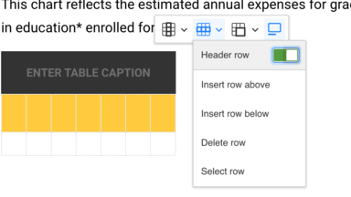
A table is a structured set of data made up of of rows and columns (tabular data). You can start by specifying how many columns and rows you want to start with. You can add to it as you enter your data. A table will be instantiated within the editor and a toolbar will appear over the table. Using the toolbar add/remove columns/rows, designate the headers and provide a table caption.
Note: Though not required, a caption is strongly recommended to provide an overall description of the data found in the table.
After initializing the table, you can enter data and/or right-click on the table to add additional rows/columns or edit table properties.
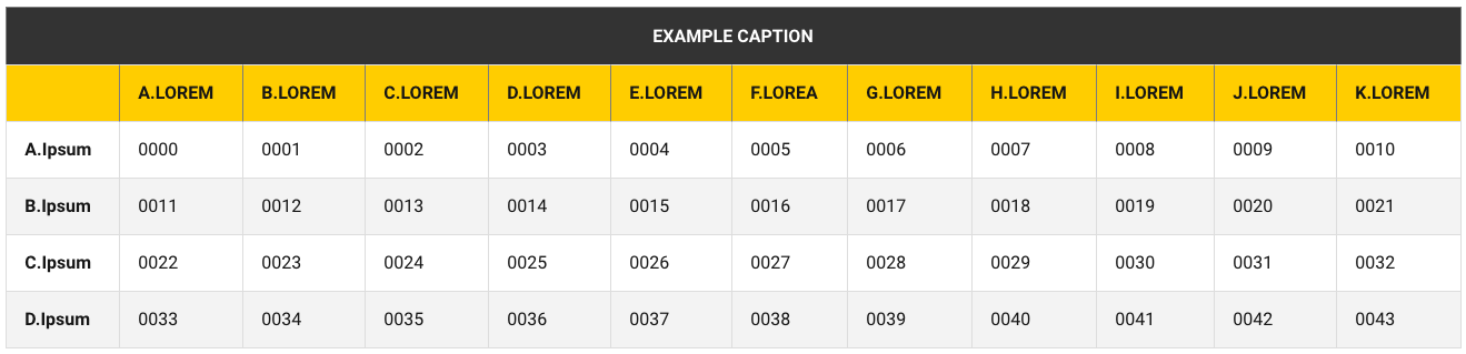
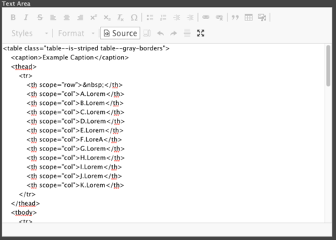
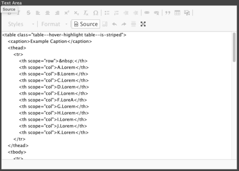
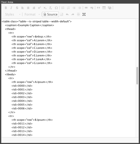
You may also want to add additional functionality to your tables through manual class addition. This can be done by clicking the "Source" button, and then adding classes to your table markup. Style attributes will be stripped from the markup. The options for this are as follows:
`table--gray-borders`
If you would like to add gray borders to your table like the example below, you may add the `table--gray-borders` class to your table markup.
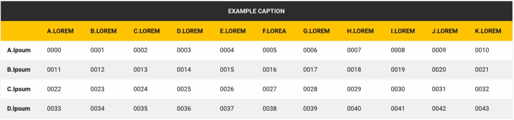
`table--hover-highlight`
If you would like a light highlight to appear over the rows of your table like the example below, you may add the `table--hover-highlight` class to your table markup.
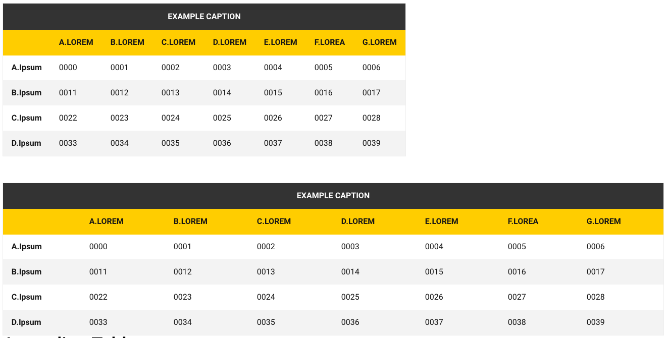
`table--width-default`
In SiteNow, tables expand to fit the full width of the page or container. If you have a narrow table that you do not wish to have fill that width, you may add the `table--width-default` class to your table markup.
(An example of identical tables, one with `table--width-default`, and one without)
Styles
Using the “Styles” drop-down, you can add paragraph styles within your content. The paragraph style will be applied to the current line/paragraph. Hit Enter/Return to break out and return to to the normal format. In addition to headline styles, there are alert styles for <div> elements and primary and secondary button styles for <a> elements. <div> elements can only be constructed in Source mode as everything in the rich text editor defaults to <p> elements.
Headings
Using the “Paragraph” drop-down, you can add headings within your content. The heading will be applied to the current line/paragraph. Hit Enter/Return to break out and return to the normal format.
It is important for accessibility and usability that headings are used sequentially and not for style purposes.
You can apply different styles to headings using the "Styles" dropdown
Blockquotes
A blockquote element defines a section of the webpage that is quoted from another source. The blockquote visually indicates that the text is a quote. SiteNow v3 provides a blockquote component for Layout Builder that has more options.
Media
The Media buttons allow you to add new or existing images, audio files, social media, files, or videos from a URL to your content. A separate configuration window will load when clicked and allow you to select the desired media type.
Images require alternative text to provide more information about the media object to the user. In the WYSIWYG you can provide instance specific alternative text that fits better with the context surrounding the media item.
You can configure the size, alignment of images as well as provide a caption. To change configuration for a media object click the media object to select it followed by the media button up on the toolbar.
View more on our Media Documentation
Source
You can look under the hood at anytime to see the markup for the content. If you know your stuff you can write your own HTML staying within the restrictions of the filtered_html format.
You can see the available HTML tags/options on your site at /filter/tips.
HTML that is not allowed will be stripped out on save or before rendering to site visitors.