Building a webpage from scratch is always an exciting challenge. It’s your opportunity to create something fresh, tell a compelling story, and showcase the University of Iowa in a way that connects with your audience. Whether you’re starting a new page or updating an existing one, a few key design tweaks can make a world of difference. Here are some simple, effective tips to help you improve your webpage and create a polished experience.
Plan your information hierarchy
Before you start designing your page, take a step back and think about how you want to organize your content. Information hierarchy refers to the order in which your audience will encounter and navigate content. What should appear at the top, middle, and bottom of the page? Where should calls to action (CTAs) be placed?
For example, if your goal is to encourage audiences to apply to a program, the most important information—like application instructions and admission requirements—should be placed at the top of the page. Secondary information, such as newsletter sign-up details, can be positioned lower down, as it’s not the primary focus for audiences interested in applying. Not all information can take priority, so it's crucial to understand which content is most important and place lower-priority details further down the page. Once you have a clear sense of your information hierarchy, building out the page becomes much easier and more purposeful.
Group related content together
For a better experience, it’s essential to keep related content grouped together on a webpage. Splitting up similar topics can confuse an audience and make it harder for them to find the information they need. By logically organizing related content, you guide audiences through the page in a natural flow, making it easier to navigate and absorb the information. For example, placing calls to action next to relevant content—like including application links or contact details alongside program information—helps an audience take the next step without having to search for additional resources.
Embrace white space and avoid clutter
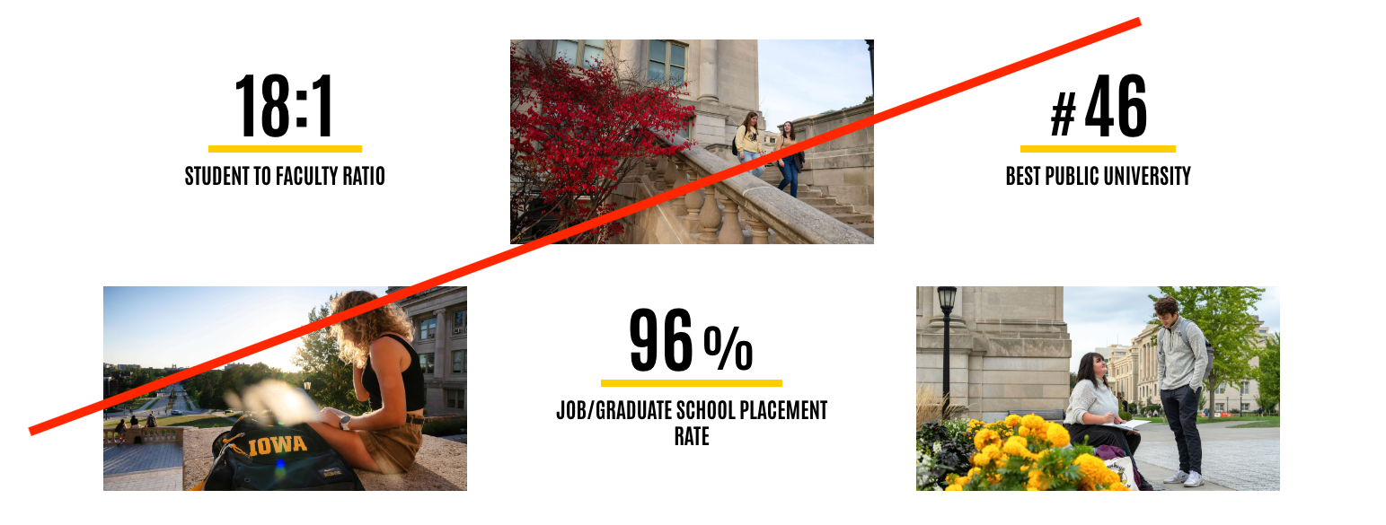
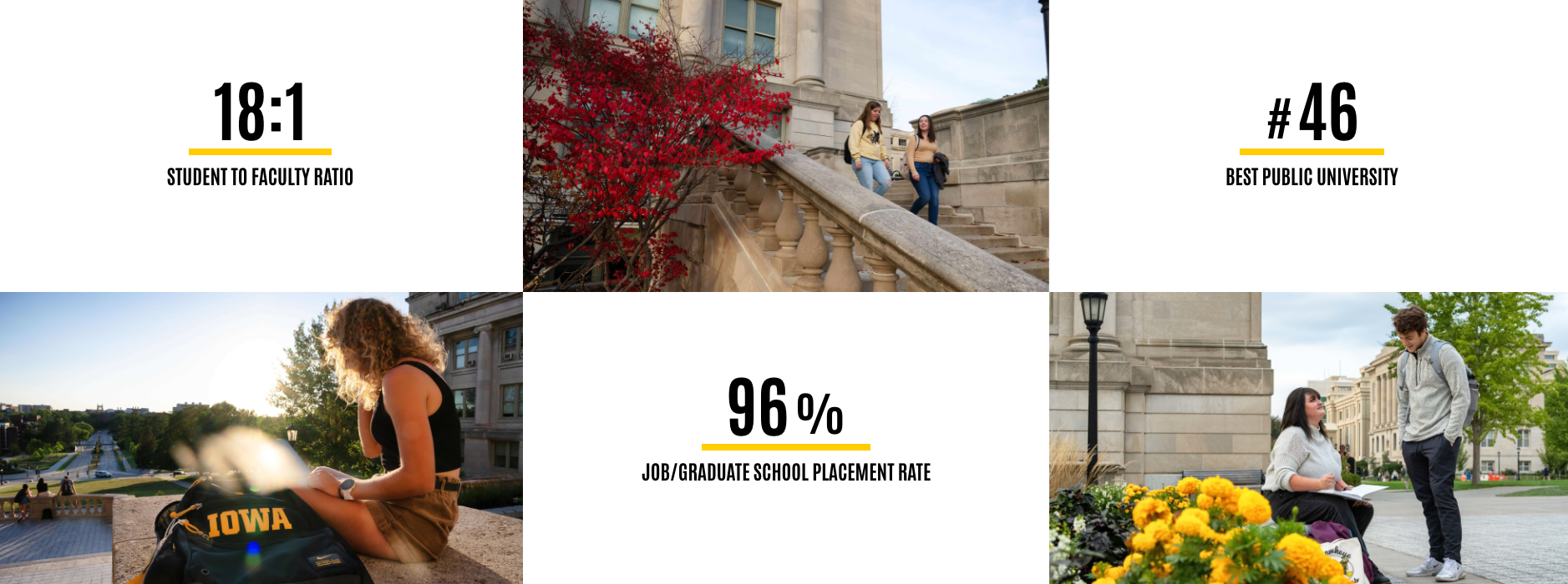
One of the quickest ways to make your webpage look unprofessional is by overcrowding it with too many patterns, colors, or competing design elements. A cluttered page can overwhelm a website visitor, making it hard for them to focus on what’s important. Instead, make good use of white (or light grey) space. This gives the page room to breathe, making it feel open, clean, and easy to read. It also improves accessibility, as pages with proper spacing are easier to navigate for people with visual impairments. When it comes to patterns, stick to one or two simple designs to highlight key areas—like calls to action or important information. For more tips on using patterns effectively, check out our Using Patterns Effectively training.
Choose authentic, engaging images
Images play a huge role in the overall feel of your webpage. Instead of using generic stock photos, opt for high-quality, authentic images that show real students, faculty, and campus life at Iowa. These types of images help your audience connect with the University on a personal level, giving them a glimpse into the experience they can expect. Avoid using stock images that look staged or impersonal, as they often fail to capture the true spirit of the university. Instead, focus on dynamic, genuine images that tell a story and reflect the authenticity of the Iowa community. For guidance on selecting and optimizing images, refer to our Adding Dynamic Web Images training.
Fix any spacing gaps
Once you’ve arranged your content, take a moment to review the spacing between sections. Are there any large, awkward gaps that disrupt the flow? Tightening up these areas will help your page look more cohesive and polished. When sections flow seamlessly into each other, the page feels more professional and easier to navigate.
Maintain consistency across pages and limit long paragraphs
When organizing content, it’s essential to ensure that similar pages across your site follow a consistent structure. Consistency helps audiences navigate more easily and know what to expect from page to page. For example, if you have several pages about residence halls, they should all have the same layout and format, so audiences feel familiar with the structure across different sections. Additionally, avoid overwhelming a page with long paragraphs. Break up large chunks of text into smaller, more digestible sections, and group related information together to improve readability. Using components like the collection tool can also help organize content into easily scannable sections, making it simpler for audiences to find key details.
Lastly, remember that not every piece of information needs to be on your website. Some content, such as organizational charts or detailed workflows, may be better placed elsewhere. By focusing on clarity and conciseness, you’ll create a better web experience.
By following these best practices, you’ll create a webpage that’s not only visually appealing but also engaging to your audience. With these simple changes, your webpage will go from good to great, delivering an experience that reflects the professionalism and quality of the University of Iowa.